brand identity.

Logos, visual systems, and creative direction designed to build cohesive brand experiences.

sarah’s sweets.

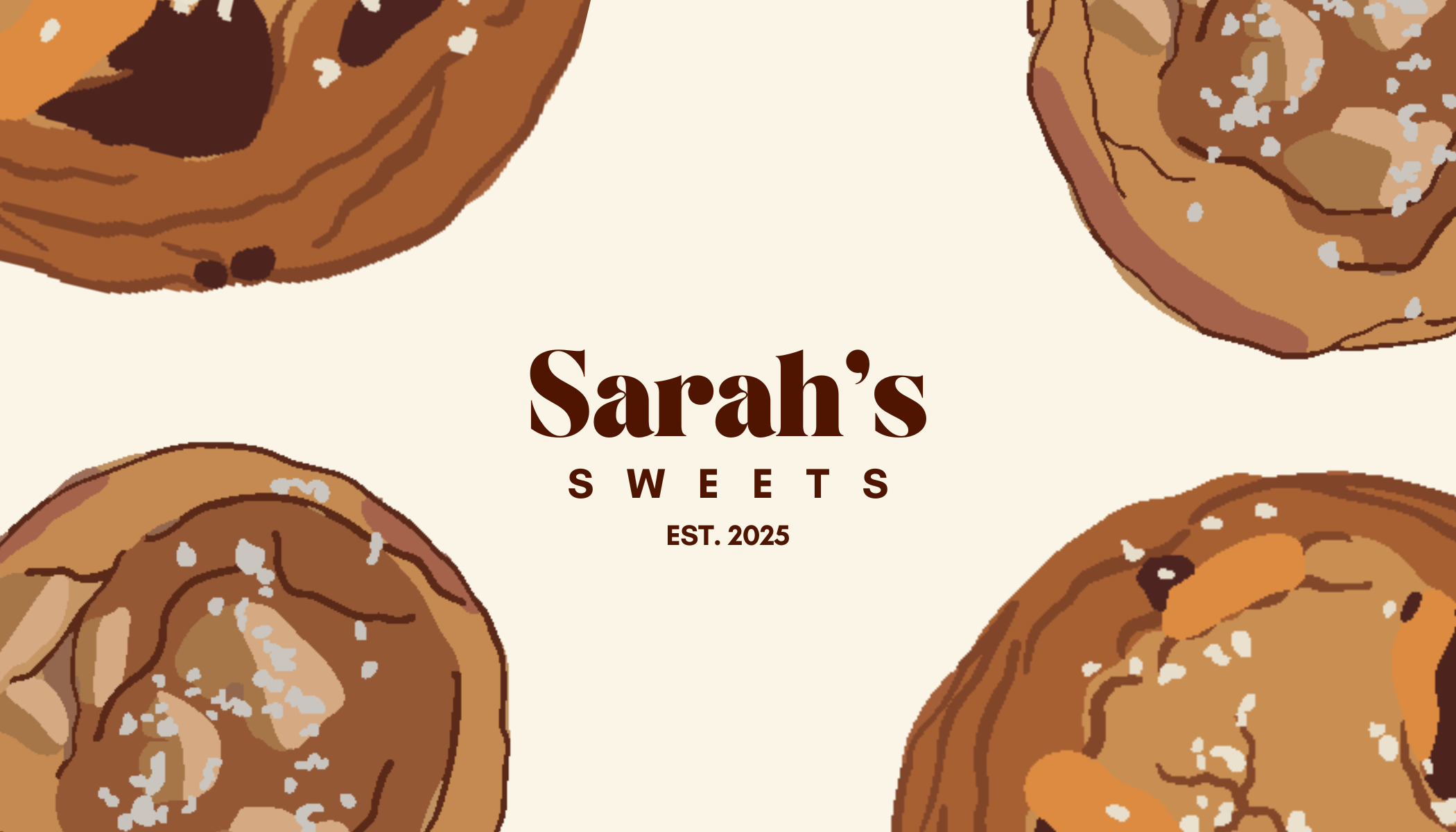
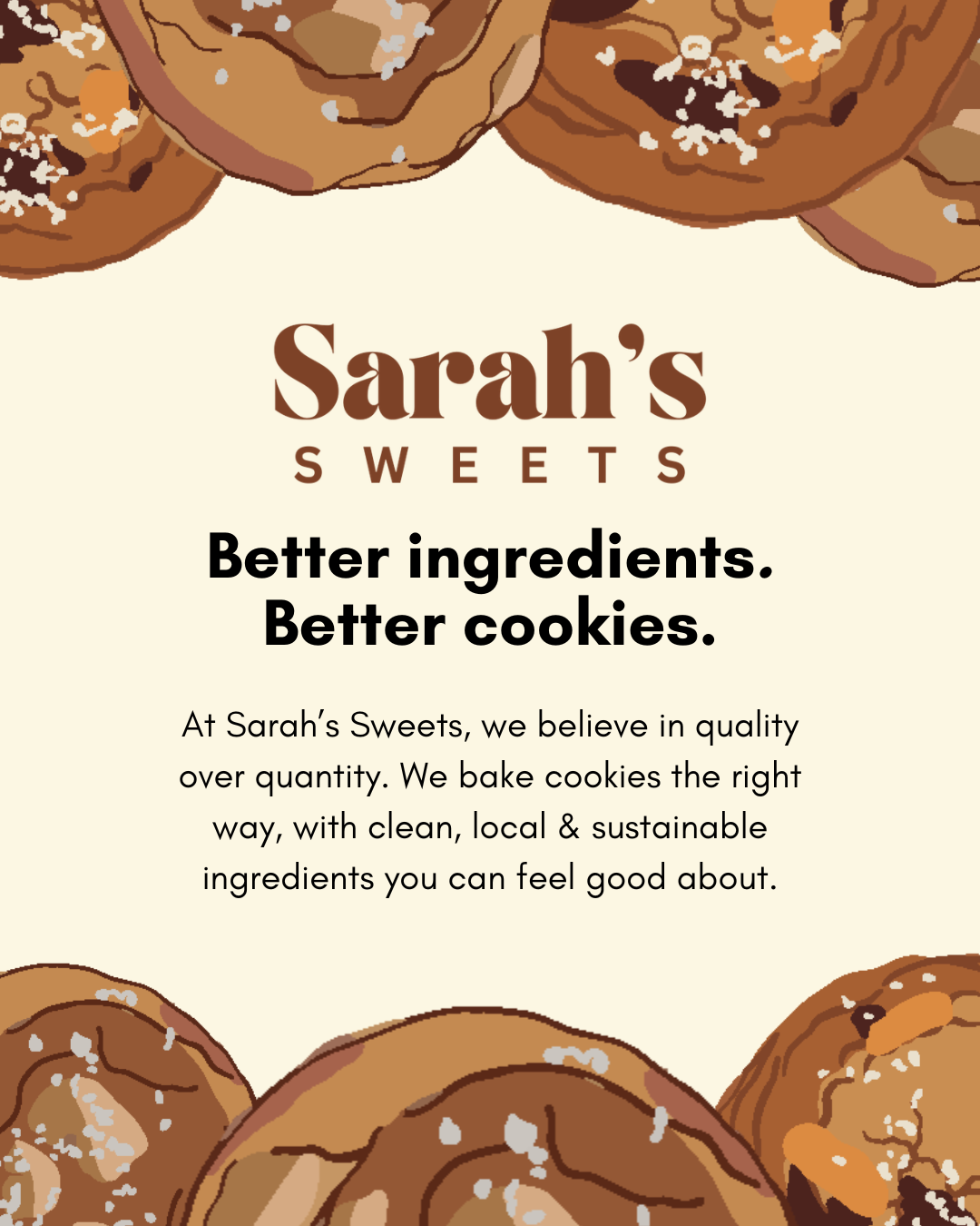
Sarah’s Sweets's was built around the idea that cookies can feel indulgent while still being made with thoughtfully sourced ingredients. the branding balances playful visuals with a warm, homemade feel, helping communicate the brand’s focus on better ingredients, no seed oils, and cookies that feel just as good as they taste.
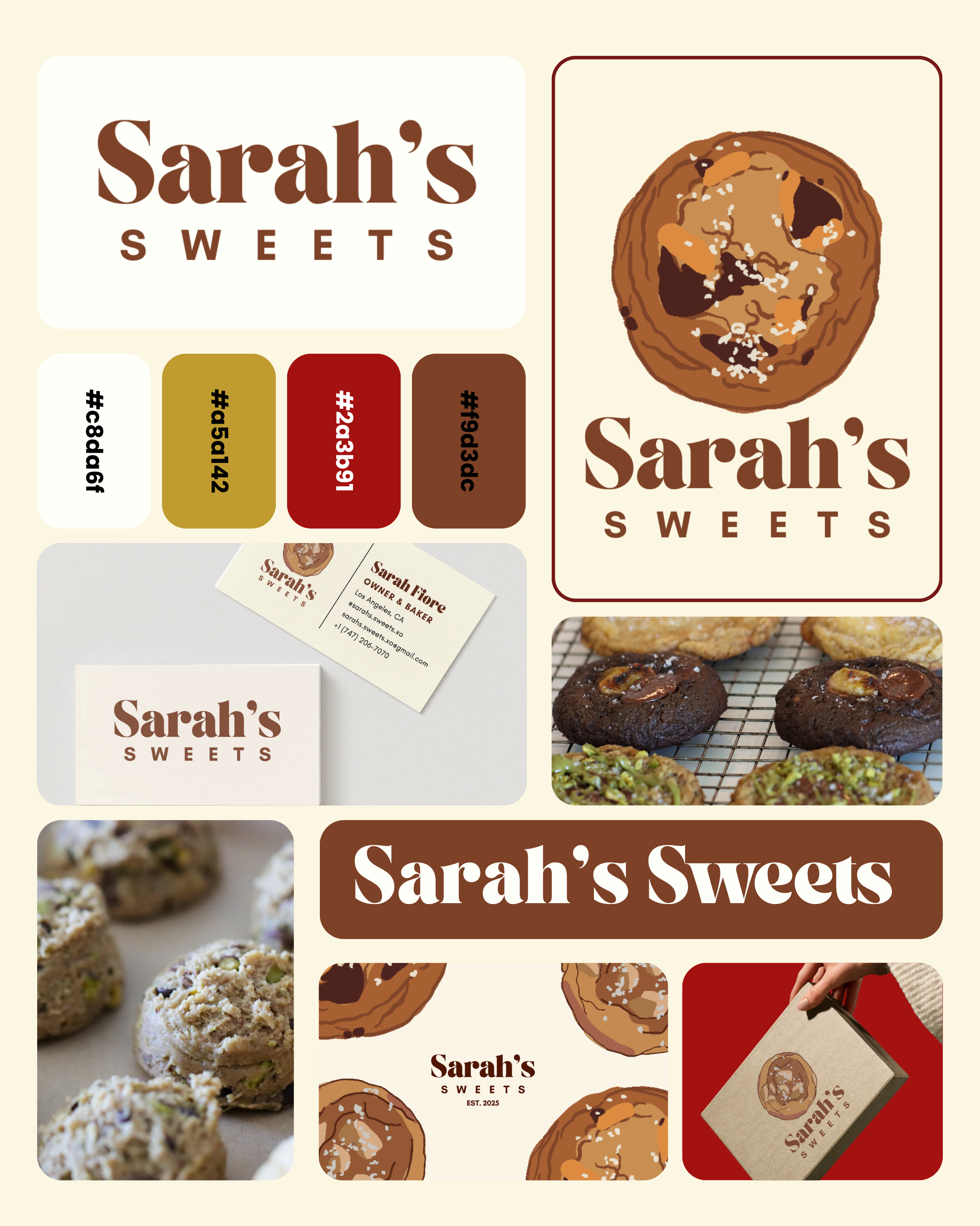
Display of branding materials for Sarah's Sweets, featuring logo and images of assorted cookies, including chocolate chip and pistachio cookies.
Sarah's Sweets logo in brown text on a beige background.
Logo for Sarah's Sweets with red text on a white background.
Illustration of chocolate chip cookies with salt flakes, part of a bakery branding for Sarah's Sweets established in 2025.
A promotional poster for Sarah's Sweets featuring illustrated chocolate chip cookies at the top and bottom of the image. The text emphasizes quality ingredients and baking practices.

spicy ent.

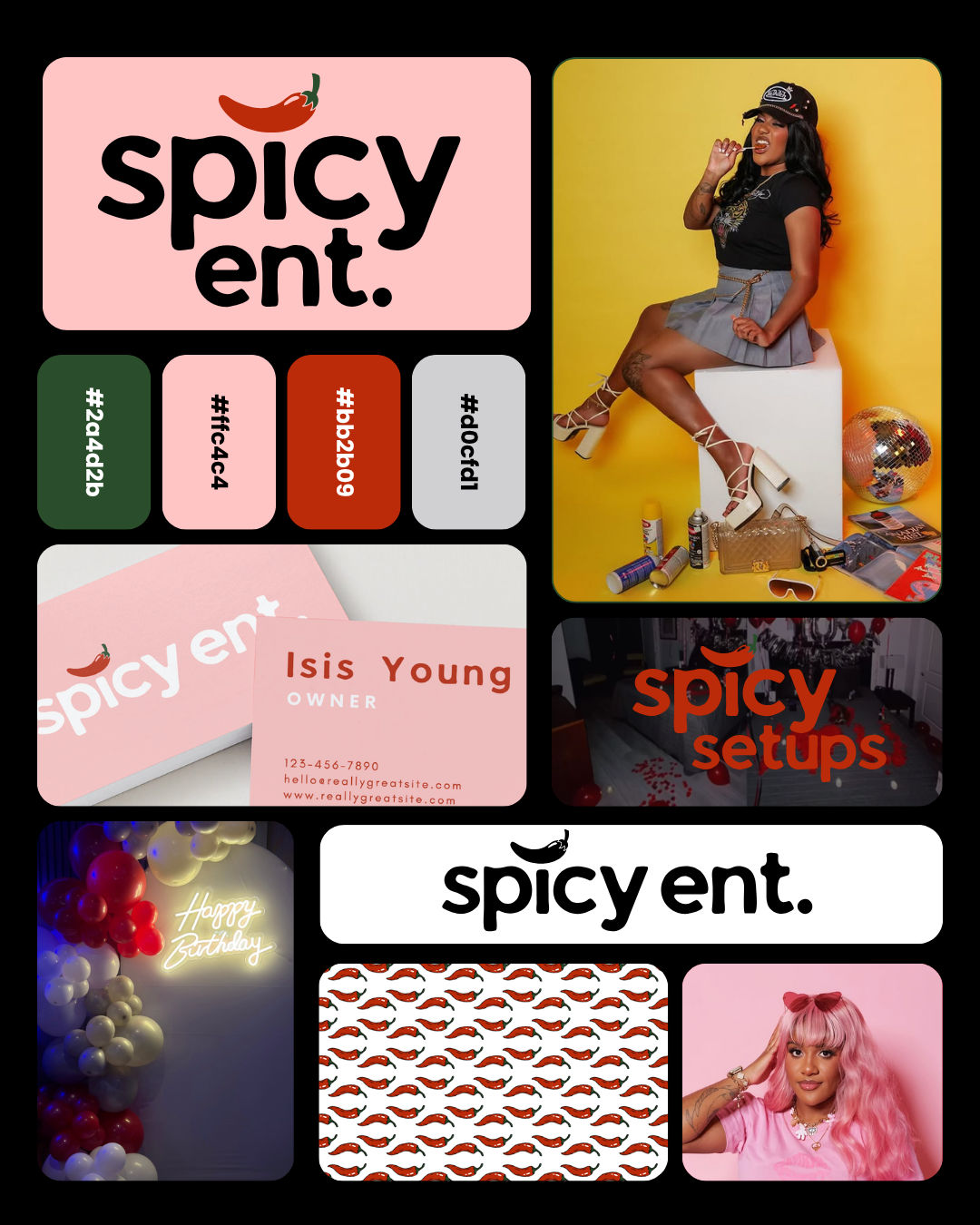
Spicy Ent’s visual identity was designed to feel bold, energetic, and culturally connected, balancing playful creative direction with a strong digital presence. The branding focuses on eye-catching visuals and expressive design elements that reflect the brand’s personality while helping it stand out across social and promotional platforms.

Collage of promotional material for spicy ent, including branding, a woman posing with products, business cards, balloons, and patterned designs.
Logo for Spicy Setups with a red chili pepper above the word 'spicysetups' in red text.
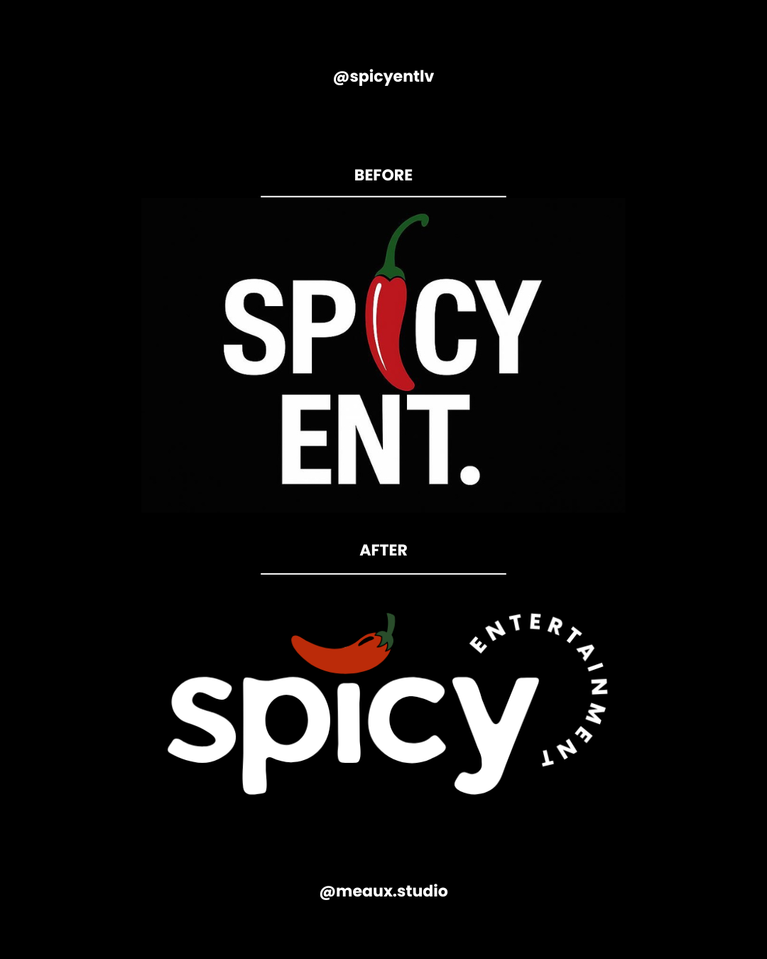
Before image with the word 'Spicy' replacing the letter 'i' with a red chili pepper. After image with the word 'spicy' featuring an orange chili pepper above the letter 'i' and the word 'entertainment' curved around the word 'spicy'.

talice travel.

sarah’s sweets's was built around the idea that cookies can feel indulgent while still being made with thoughtfully sourced ingredients. the branding balances playful visuals with a warm, homemade feel, helping communicate the brand’s focus on better ingredients, no seed oils, and cookies that feel just as good as they taste.
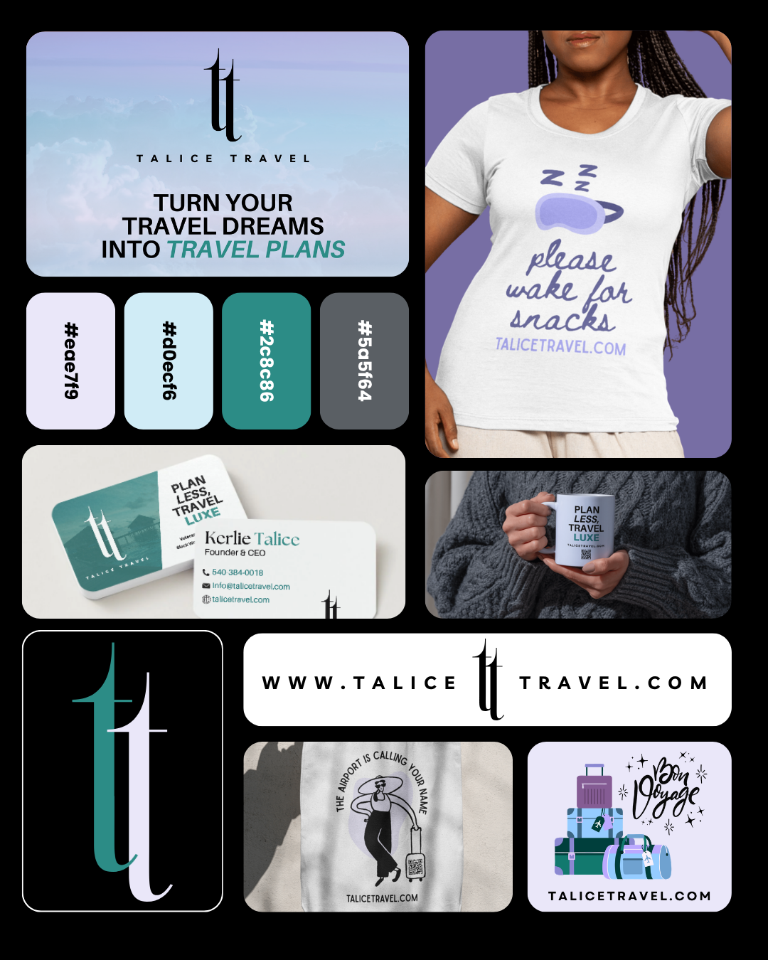
Collection of travel branding items including business cards, a t-shirt with a coffee cup and the phrase 'please wake for snacks,' a mug, stickers, and digital graphics promoting Talice Travel with slogans like 'Turn your travel dreams into travel plans' and 'Plan less, travel luxe.'
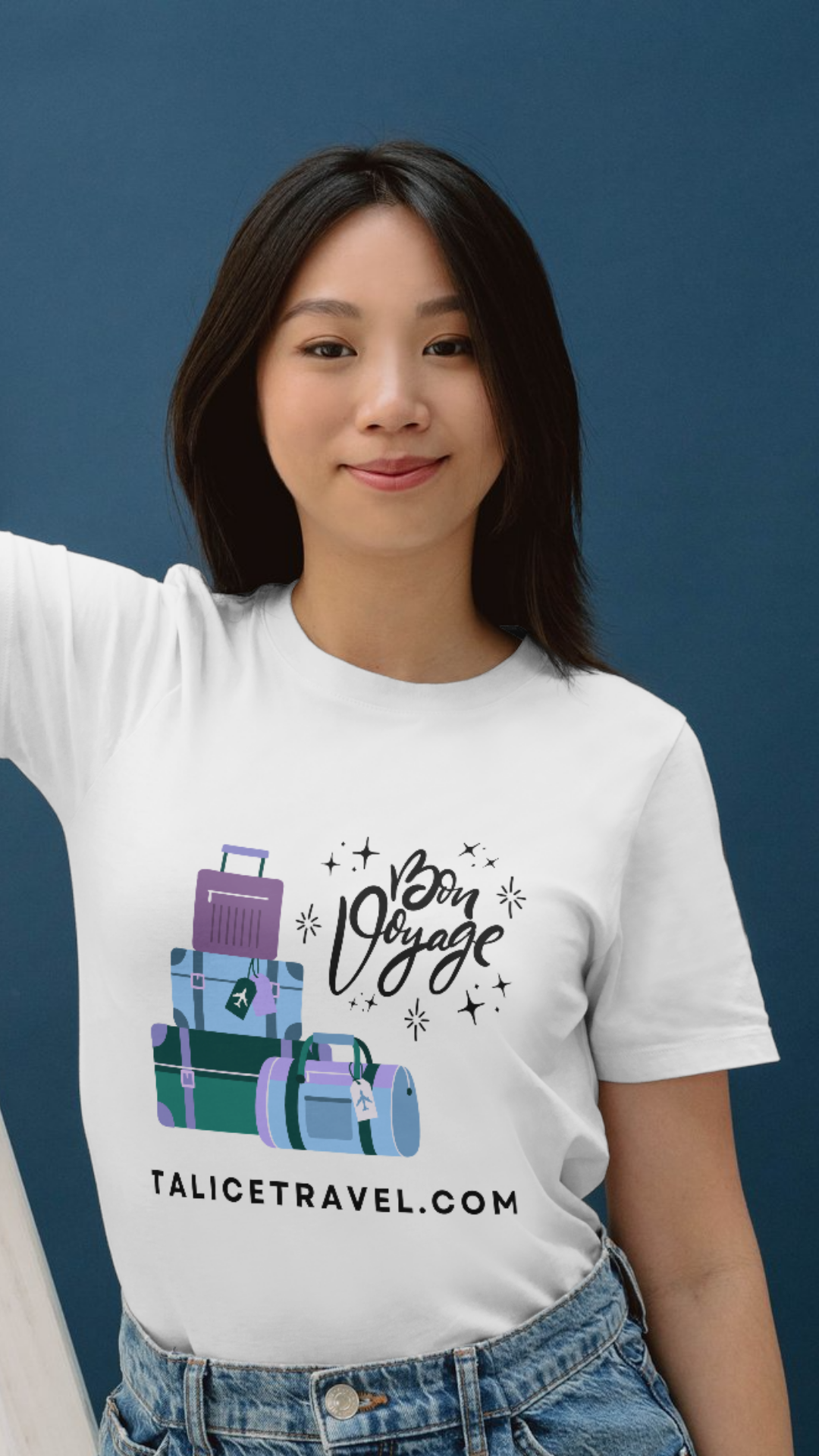
Young woman wearing a white travel-themed t-shirt with stacked suitcases and the text "Bon Voyage" and "talicetravel.com" against a blue background.
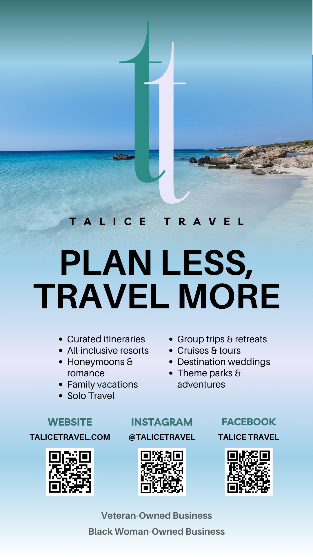
Travel advertisement with a beach background featuring large text 'Plan Less, Travel More', company name Talice Travel, social media and website information, QR codes, and mention of veteran and Black woman ownership.

out of the group chat.

Out of the Group Chat was designed to feel playful, conversational, and instantly recognizable, pulling inspiration from digital culture and everyday connection. The branding combines bold visuals with personality-driven design to create a social-first identity that feels expressive, relatable, and built for community.
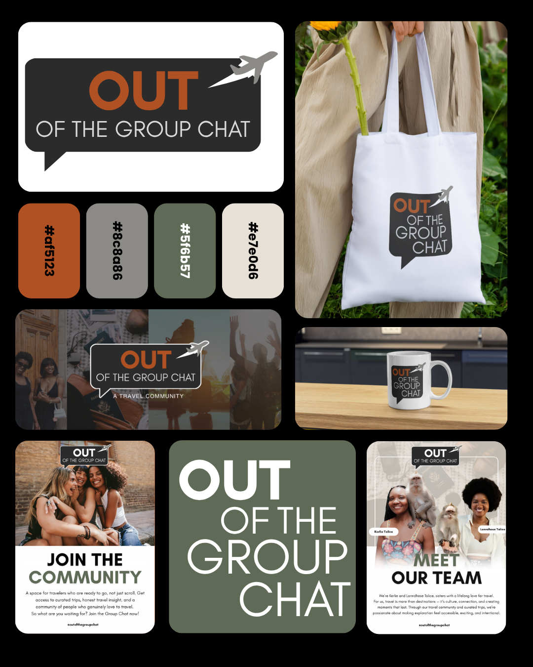
Collection of branding and marketing materials for 'Out of the Group Chat', including a logo with an airplane icon, a tote bag, a mug, a social media graphic featuring people at a social event, and informational posters about joining the community and meeting the team.
A travel community graphic with the text 'Out of the Group Chat,' overlaying images of people traveling and enjoying outdoor activities.
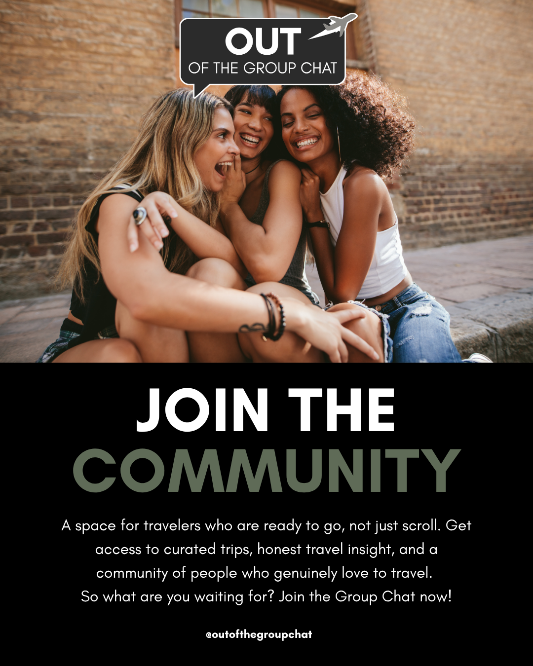
Four smiling women sitting together outdoors in front of a brick wall, with a speech bubble that says "OUT OF THE GROUP CHAT," promoting joining a community for travelers.